- Exercise 1.25 (1 Point), 1.29 (1 Point), 1.43 (3 Points)
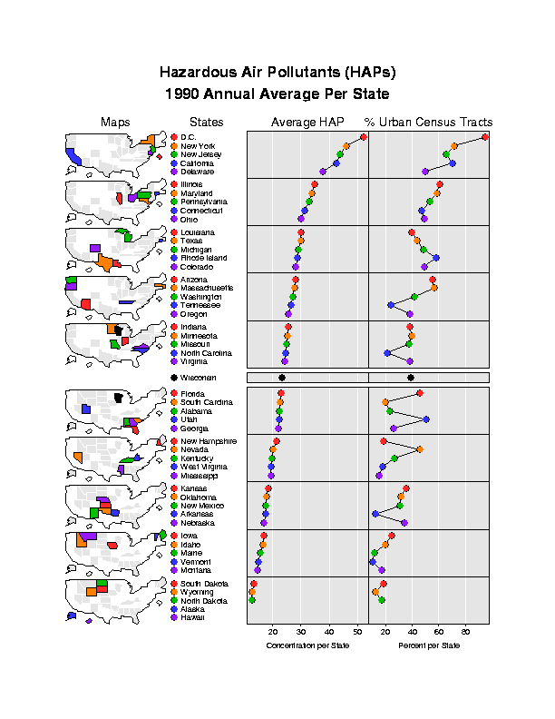
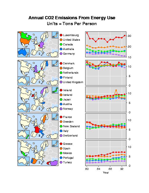
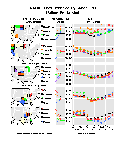
Many more designs and examples for micromaps exist. Several articles on micromaps have been published in the Statistical Computing and Statistical Graphics Newsletter by Carr et al., e.g., in Vol. 7, No. 3, pp. 16-23, and Vol. 9, No. 1, pp. 24-32. Actually, the micromaps with the CO2 data and the wheat data are Figures 1 and 2 of the Carr et al. article in Vol. 9, No. 1.
The Statistical Computing and Statistical Graphics Newsletter is accessible at http://cm.bell-labs.com/cm/ms/who/cocteau/newsletter/index.html and provides access to complete issues as pdf and postscript files. It is informative and easy to read.
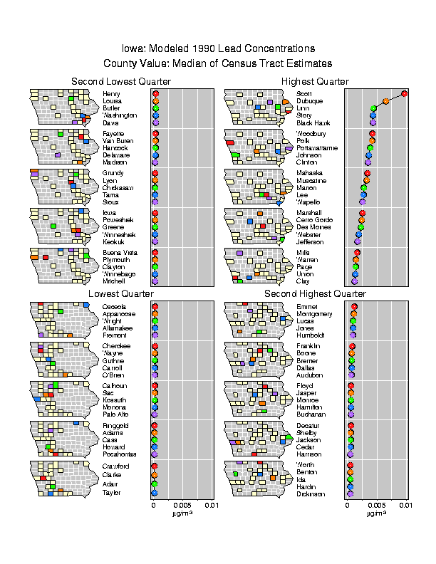
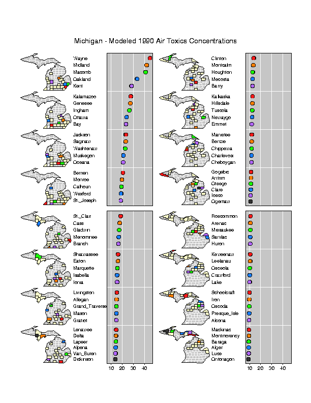
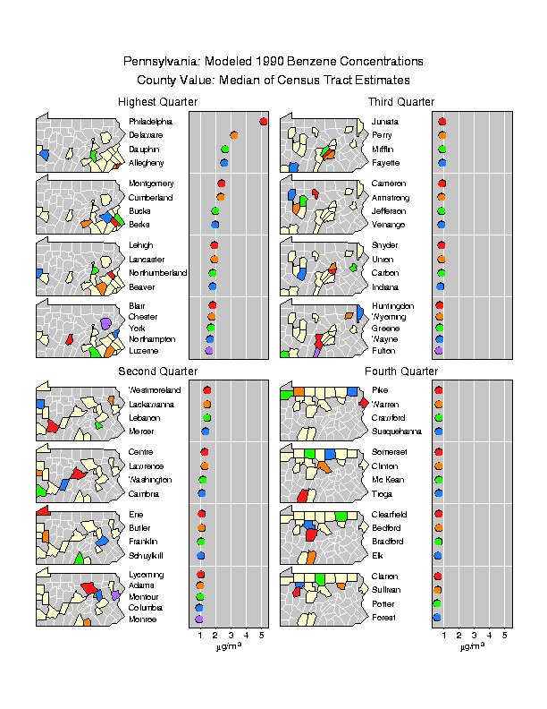
Here are three more micromaps for Iowa, Michigan, and Pennsylvania. Select one of these three maps and carefully describe and interpret it (about one half page up to one page). Use all your geographical knowledge (e.g., where are big cities, sparsely populated rural areas, what is happening in counties just outside the visible area) and technical knowledge (where do benzene and lead originate from? - note that the data for Michigan is an aggregation of 148 HAPs with lead and benzene as major components). Also note that the data is from 1990. (6 Points)
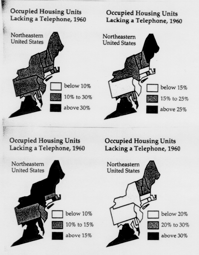
- a) (i) If you were the governor of New York, which graphic would
you use to demonstrate how advanced your state is?
(ii) If you were the governor of Connecticut, which graphic would you use to demonstrate how advanced your state is?
(iii) If you were the governor of New Jersey, which graphic would you use to demonstrate how advanced your state is?
(iv) If you were the governor of Virginia, which graphic would you use to demonstrate how far behind your state is and desperately needs federal funding?
(v) If you were a historician who wants to show how few telephones were around in 1960, which graphic would you use?
- b) Now find the "true" interval for the following 5 states.
Do this by calculating the intersection of the class intervals used within
the 4 graphics above:
Maine
New York
Connecticut
New Jersey
Virginia
- c) Describe your findings from b) in one or two sentences.
- d) Now think of micromaps. Can you manipulate these as easily as these maps to express different political opinions? Explain. Describe how a micromap of this data might look like.
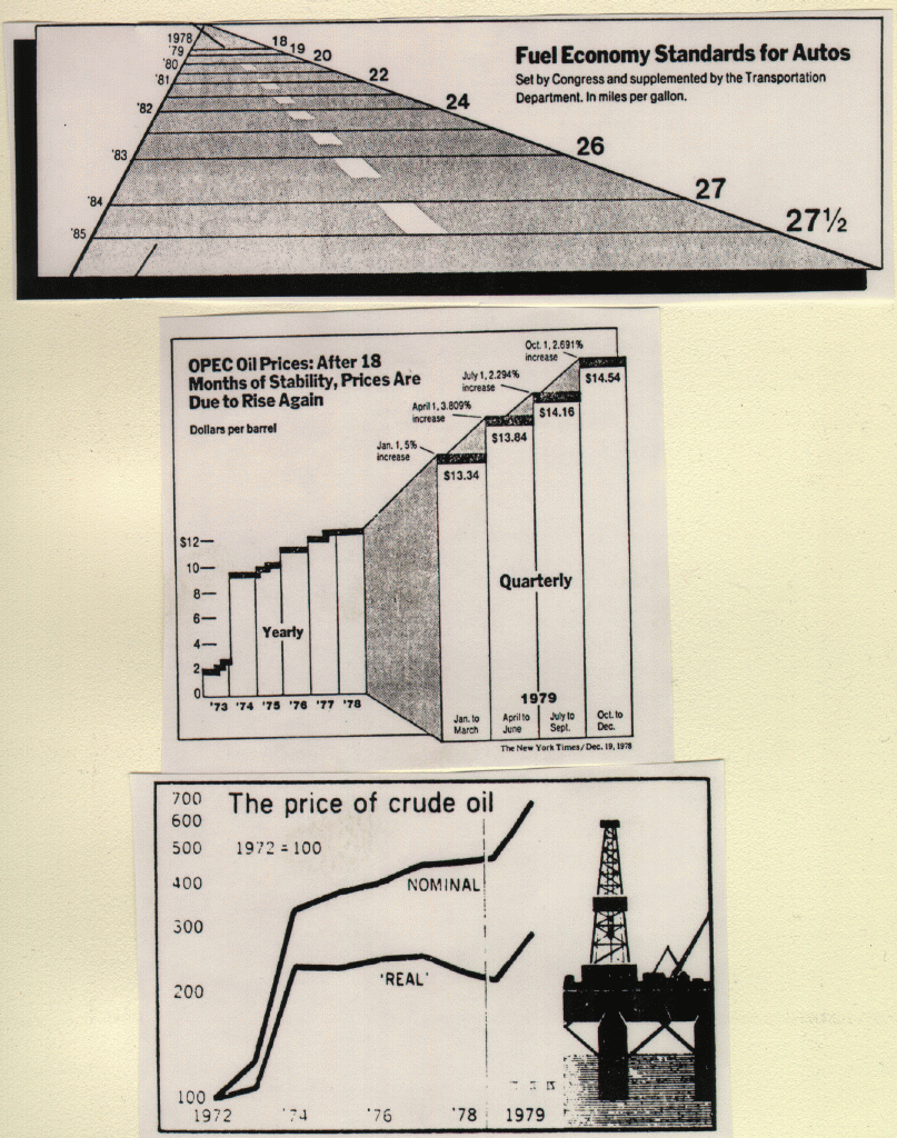
Unfortunately, the small print got lost when scanning in these graphics.
In the upper graphic, the lines under "Fuel Economy..." read "Set by Congress and supplemented by the Transportation Department. In Miles per gallon".
In the middle graphic, the text at the 4 markers in the upper right part reads: "Jan 1, 5% increase", "April 1, 3.809% increase", "July 1, 2.294% increase", and "Oct. 1, 2.691% increase". The Dollar amounts given underneath are "$13.34", "$13.84", "$14.16", and "$14.54". The labels at the bottom under "1979" read "Jan to March", "April to June", "July to Sept.", and "Oct to Dec".
In the bottom graphic, it should read "1972 = 100".